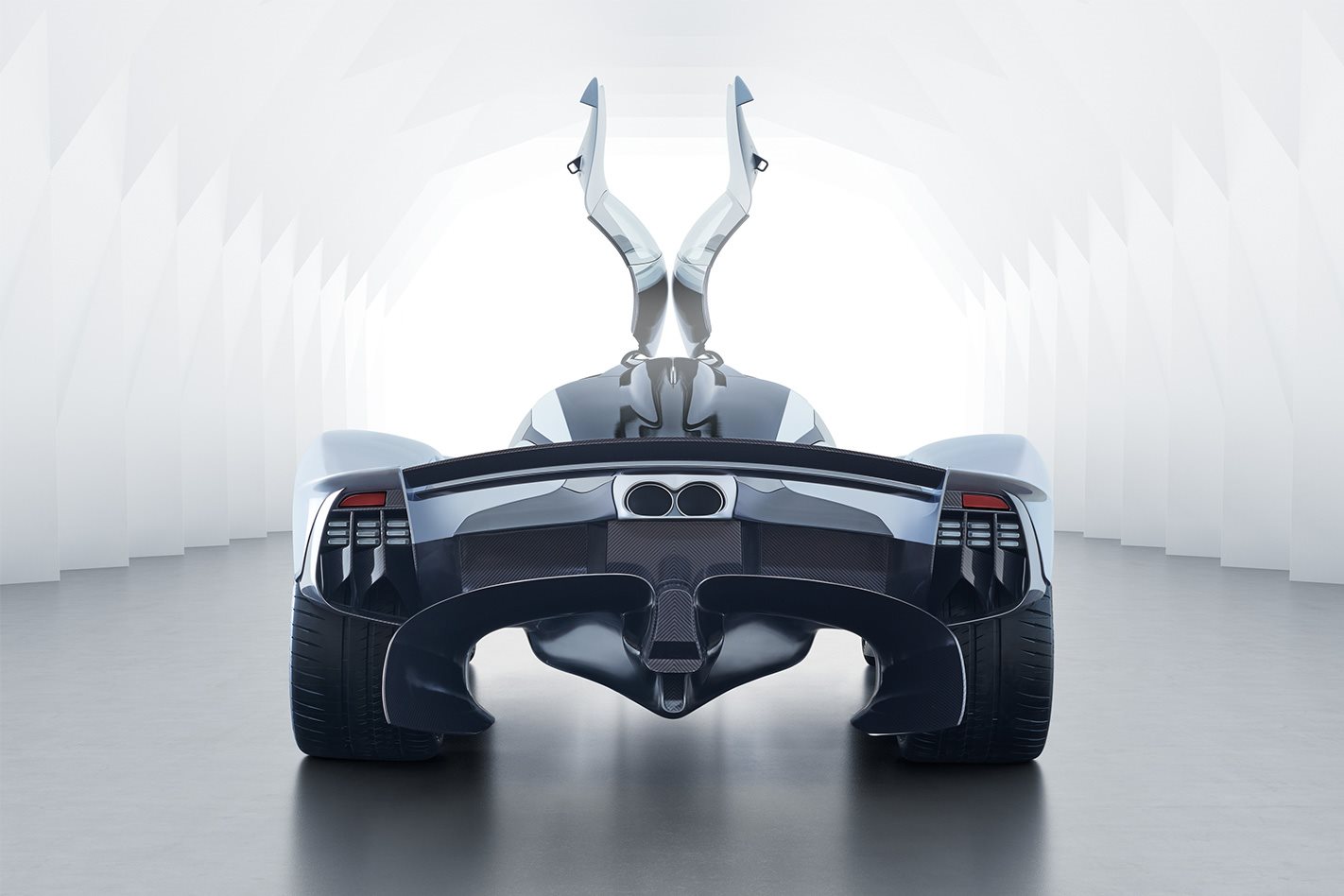
Ever since Aston Martin first started touting figures for its extreme Valkyrie hypercar, we’ve wondered whether the project would ever come to fruition.
It seemed such a reach for a company with relatively limited resources, but the latest news from Gaydon suggests the project is progressing apace.
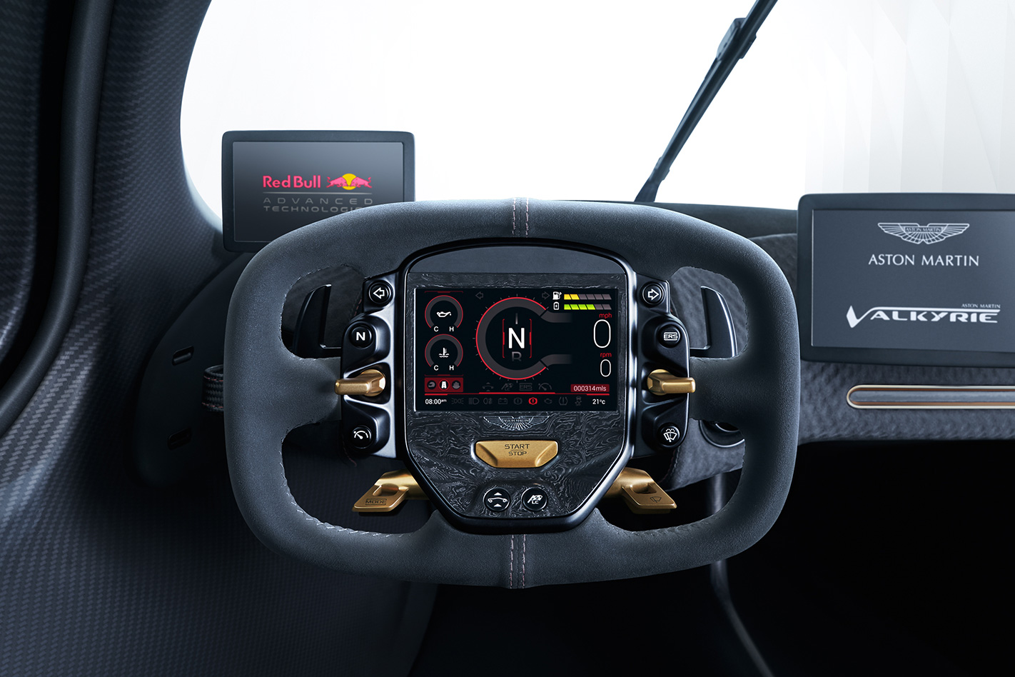
This is the first time we’ve seen the interior and it’s certainly minimalist.
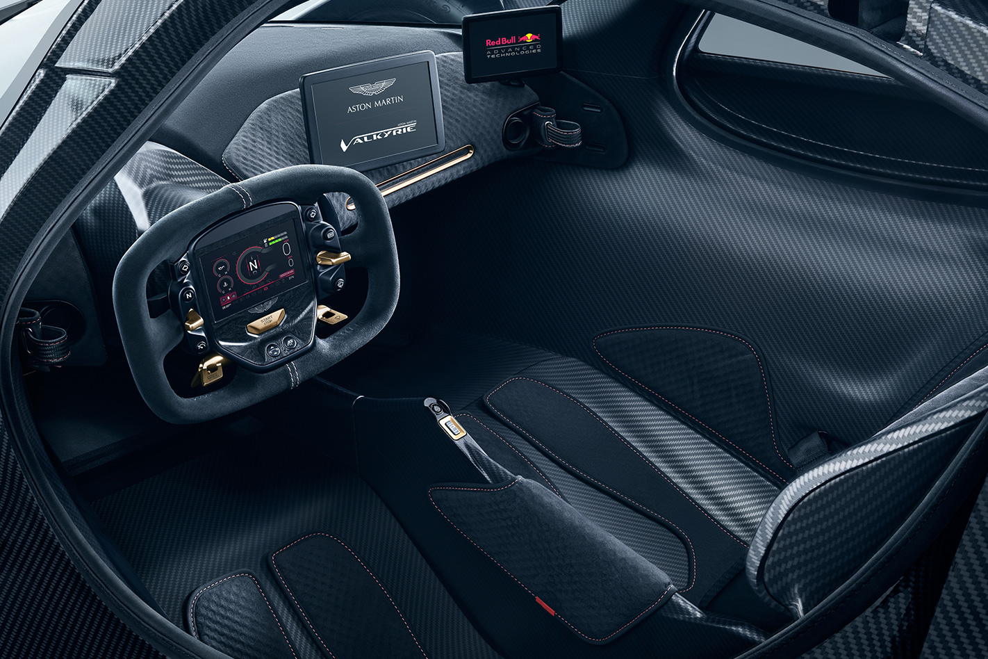
If you were expecting the drama of a LaFerrari, the polish of a Porsche 918 or the techy cool of a McLaren P1, you may well be disappointed.
Matt Hill, Aston Martin Creative Director of Interiors clearly sees things a bit differently and touches on some of the design constraints placed upon him by the Valkyrie’s radical, insect-like exoskeleton.
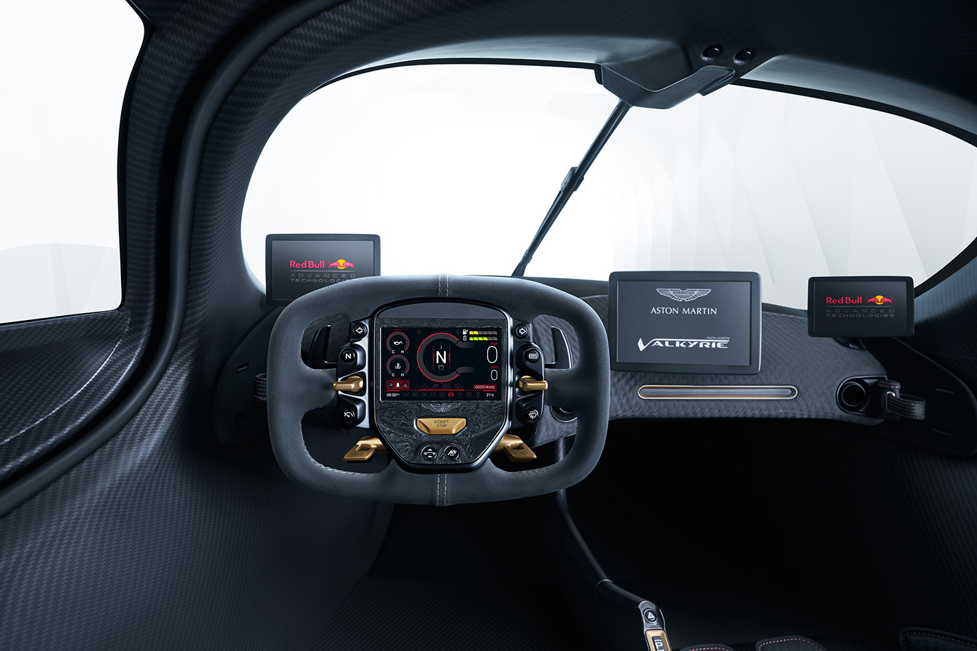
“In this instance, we’ve started from a position where you think something is impossible and work at it until you find a way to make it work. We’ve been fighting for millimetres everywhere, but the battle has been worth it, as it’s been fantastic seeing customers try the interior buck for size. They love the ritual of getting in and how it feels to be sat behind the wheel. They’re also genuinely surprised at how the car just seems to swallow them.
“You really do have to sit in it to believe there is genuine space for two large adults.”
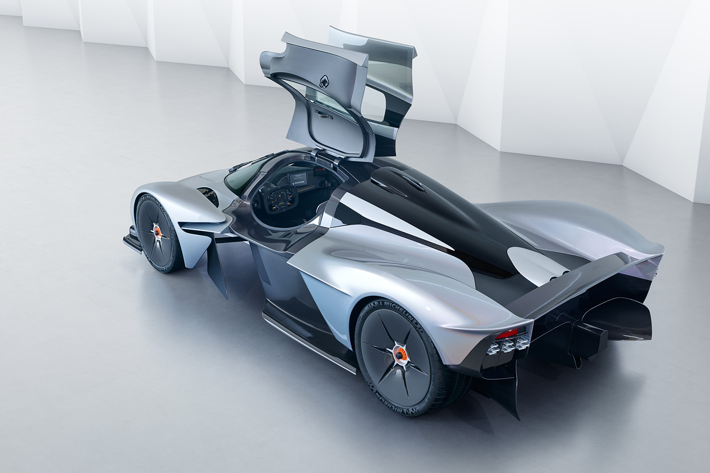
“The new outlets in the body are a case in point. Ordinarily the last thing we’d want to do to one of our surfaces is cut a hole in it, but these vents work the front wings so much harder that they’ve found a significant gain in front downforce. The fact that they are so effective gives them their own functional beauty, but we’ve finessed them without impacting on their functionality. That they also serve as windows through which to view the fabulous wing section front wishbones is a welcome bonus.”
A four-point harness is fitted as standard, and there’s also the option of six-point tethers for those who intend to do more track driving.
We absolutely love the attention to detail regarding the car’s nose badge. A conventional badge was deemed to represent excess weight, and a sticker not premium enough, so Aston Martin developed a chemical etched aluminium badge just 70 microns thick.
That’s 30 per cent thinner than a human hair, and a remarkable 99.4 per cent lighter than the regular enamel wings badge. The badge (nicknamed the ‘lacewing’) is then attached to the painted body and covered with a gossamer-thin coat of lacquer.
It’ll be a while yet before we get a functional car to test, as Newey and his team are still finessing the aero elements, but it looks as if the Valkyrie could well be worth the wait.


