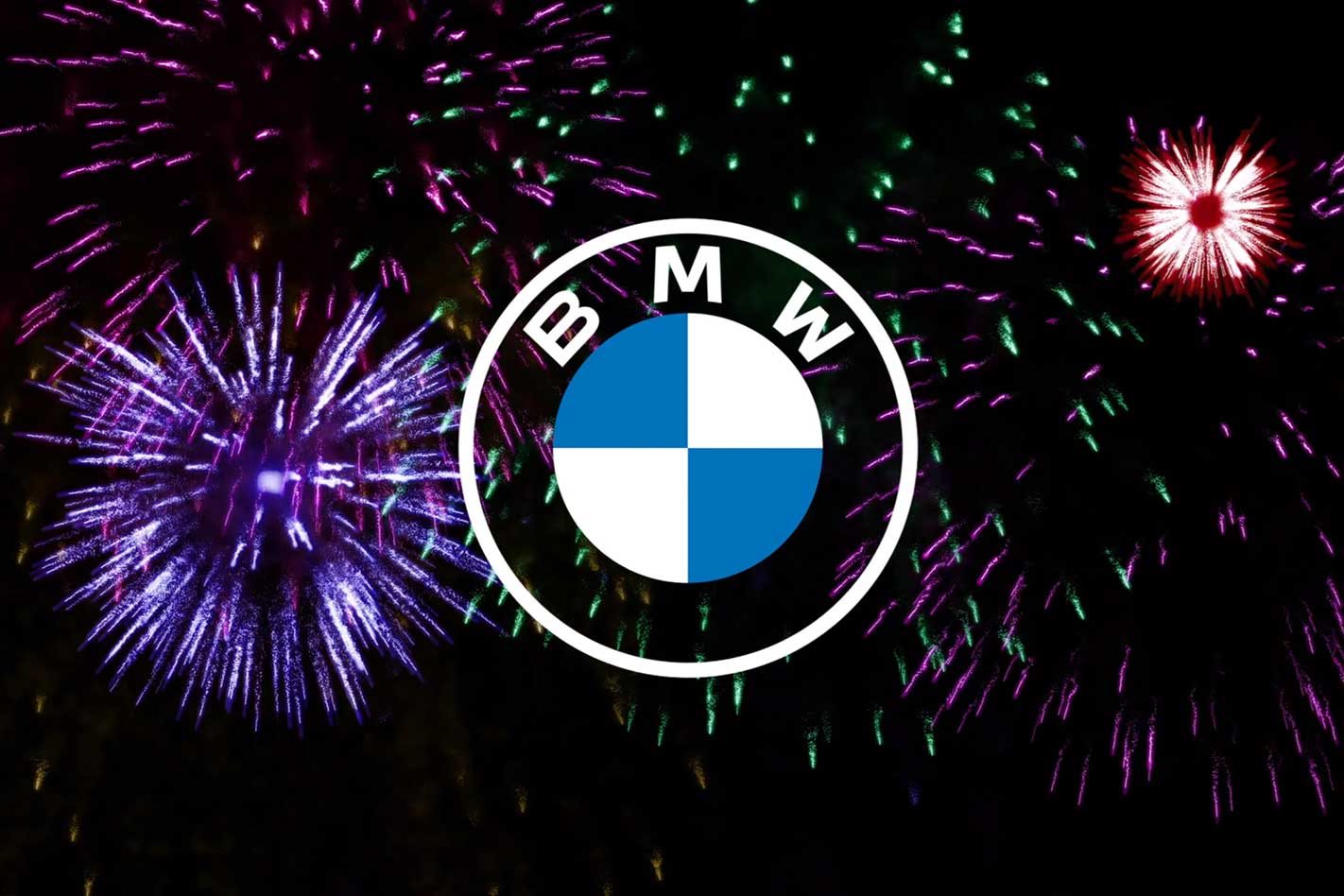
BMW has introduced a new logo. It’s the first update in more than 20 years and will be used for “online and offline communication purposes”.
The German brand claims the new pared-down, two-dimensional logo “conveys openness and clarity”, while an “additional transparent version of the logo is a more invitation than ever for customers to join the world of BMW.”
Don’t go looking for BMW’s new corporate identity in the obvious places, though. Its cars and the interior and exterior of its dealerships will retain the current logo, presumably in part because the cost of updating its 4500+ dealers would run into the many millions.
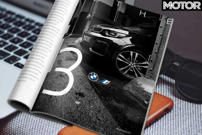
The new logo is intended for communication purposes, including trade fairs and events, and will be rolled our between March 3, 2020 and May 31, 2021.
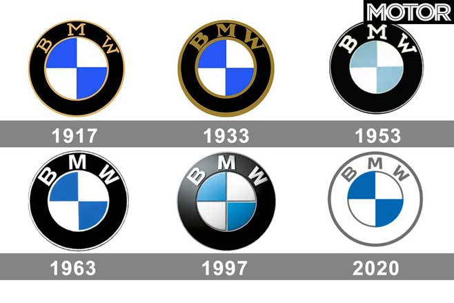
Beneath this marketing speak is a serious shift in philosophy for BMW. The 2020 transparent logo is the first time BMW has gone without the black ring surrounding the traditional blue and white quarters. Logos are how brands identify themselves to the world so any change can have major implications.
In his book Icons and Idiots industry legend Bob Lutz, having recently been hired as BMW’s Executive Vice President of Sales and Marketing, discovered new CEO Baron Eberhard Von Kuenheim had taken it upon himself to update BMW’s logo, primarily by removing the “old fashioned” black ring with BMW inscribed upon it.
Lutz was aghast at the thought of one of the world’s most iconic and recognisable brands being altered for the sake of fashion and vehemently opposed Von Kuenheim’s intention. Successfully, as it turned out.
BMW’s traditional logo has changed a number of times of the years, however. It first appeared on October 5, 1917 with the blue and white quartered ‘pie’ surrounded by a solid black ring, bound by inner and outer rings and including the letters BMW – which stand for Bayerische Motoren Werke, or Bavarian Motor Works – in the colour gold.
The black ring was carried over from the logo of BMW’s former existence as aircraft engine manufacturer Rapp Motorenwerke. It’s a commonly held belief that the alternating blue and white quarters are a nod to this aeronautical heritage and signify a rotating aeroplane propeller. Not so.
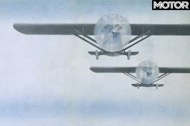
According to BMW’s website: “The company’s home state of Bavaria was also to be represented on the company logo. The quarter of the inner circle display the state colours of the State of Bavaria – white and blue.” However, as local trademark law forbade the use of coats of arms on commercial logos, BMW simply inverted the colours.
In 1933 the font changed, the colours darkened and the binding rings became thicker, then 20 years later BMW settled on the black, white and blue colour combination that continues to this day. A sharper, clearer version appeared in 1963 and endured (thanks to Lutz’s protestations) until 1997 when it morphed into a three-dimensional shield.


