SINCE ol’ mate Karl Benz invented the automobile some 135 years ago, car designers and engineers have been trying to improve it, and there’s no doubt they have, in a very big way.
From what was once seen as little more than a horseless-buggy oddity, the automobile has come a bloody long way. Today we can buzz up and down freeways at more than 100km/h in supreme comfort, with windows up and climate control set to 21.5°C, and never really gain a true appreciation of the conditions outside the vehicle, other than seeing the wipers sweep across the windscreen if it starts to rain or watching the lights come on when the sun drops below the horizon.

Many modern vehicles will accelerate from 0 to 100km/h quicker than you can select your Daily Mix on Spotify, all the while sipping fuel at a rate of less than 10.0L/100km. You can throw some vehicles into corners with barely the need to back off the throttle, safe in the knowledge the ESC has got your back. And if you dare wander out of your lane chances are a camera will steer you back on track, while a radar will stop you slamming into the back of someone when you look down to grab your morning coffee.
But it’s this looking down to grab one’s coffee that has me stumped. It should be an easy task, right? After all, the easier it is, the quicker you can do it, thereby minimising the time your eyes are off the road.
Bearing this in mind, it’s a no-brainer that car designers should situate cup holders in easy to reach spots – after all, putting a cup holder where it’s easy to reach would be much easier than developing stability control or lane departure warning systems.

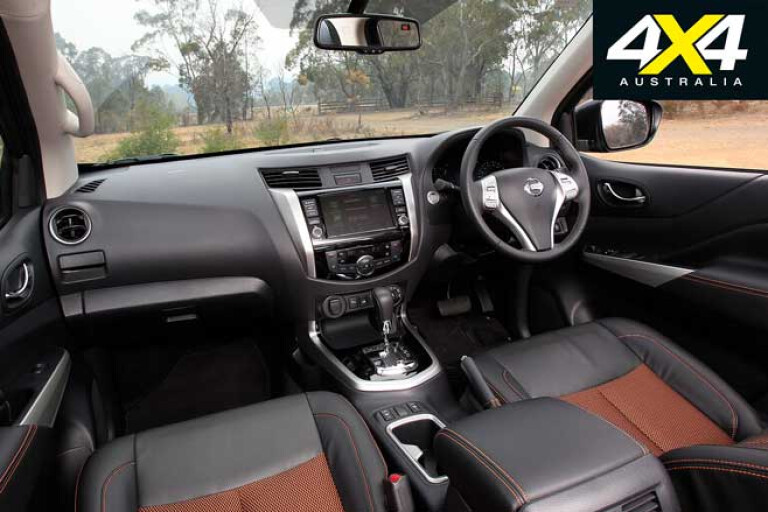
However, I have driven so many new vehicles where this is not the case. Some cup holders are situated immediately in front of the centre console armrest, and you almost need to be double-jointed to contort your arm in such a way as to lift out your coffee cup, while others are jammed under the dashboard so it’s nigh impossible to grab a bottle or cup without bumping it on the dash and spilling your drink. Placing it back where it was after a sip is even worse, because you also have to look down to find the illogically placed cup holders.
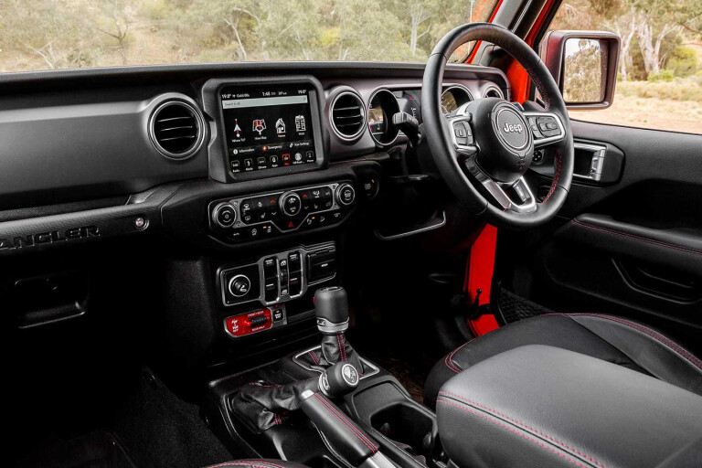
There are many other flaws when it comes to vehicle interior design, some of which are almost inexcusable. Take, for example, 4X4 Australia’s latest 4X4 Of The Year, the Jeep Wrangler Rubicon.
Sure, it’s an absolute weapon off-road, and its overall design achieves several goals including evoking the look of the original WWII Jeep, and providing incredible versatility thanks to its removable roof panels and doors, but its driver’s footwell is an ergonomic disaster, reminiscent of Italian sports cars from the 1960s and ’70s; the transmission hump is so large that it leaves no space for a footrest, so your feet feel as though they’re squeezed into a bucket. Some claim this design flaw is simply the result of the vehicle being predominantly designed for the North American (left-hand drive) market, but the JL Wrangler was always planned as an international vehicle, and in this day and age the LHD excuse simply does not wash.
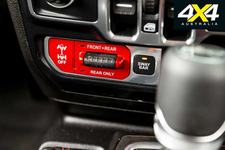
Another big problem with design involves the location and legibility of switches and controls. One example where a vehicle manufacturer absolutely got it right was when Land Rover launched the Discovery 3 with Terrain Response, the controls for which were operated by a dial. Then someone at Land Rover decided with the launch of the Discovery 4 it would be a good idea to use the dial setup for gear selection rather than Terrain Response, moving the latter to a switch-based setup. What originally worked intuitively had now become a far more complicated operation.

Another example of poor switchgear design is the heater/ventilation switches on the Ford Ranger – they are almost impossible to see if you’re wearing sunglasses. Then there are all the different steering wheel switches on different vehicles to operate cruise control systems that require the driver to look at them to use them. They are not at all intuitive, unlike the early wand setups found on Toyotas and Mitsubishis when cruise control was first being introduced on 4x4s back in the 1990s. Simply flick down to set speed, move up and down to change set speed, pull in to cancel and flick up to resume. You’d have it all worked out in five minutes and would never have to look at the wand again.
Oh, and do you reckon all car designers can place a steering wheel directly in front of a driver rather than offset to one side? I mean, really, how hard can it be?

COMMENTS