It’s rare for a car company to admit it made a mistake. It’s rarer still for that admission to be made publicly by the CEO of the company.
So when the head honcho of Volkswagen, Thomas Shafer, confessed that VW’s current button-lite cabins had “frustrated” owners and had “caused a lot of damage”, we grabbed the popcorn and nodded our heads in furious agreement.
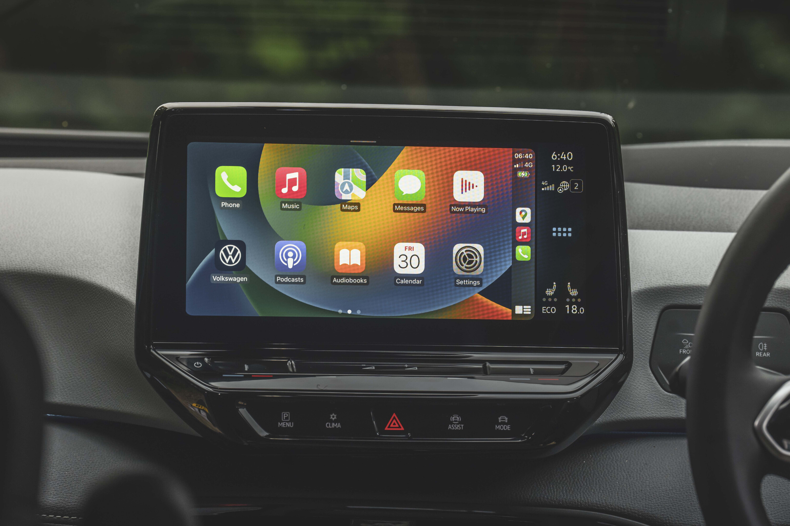
Shafer’s comments echoed what many of us had been saying for years: sometimes the simplest solutions are best. And for car interiors, that means buttons and dials.
Who wants to swipe, prod and take your eyes off the road to adjust the AC fan speed when you can twist a trusty knob that’s always where you left it?
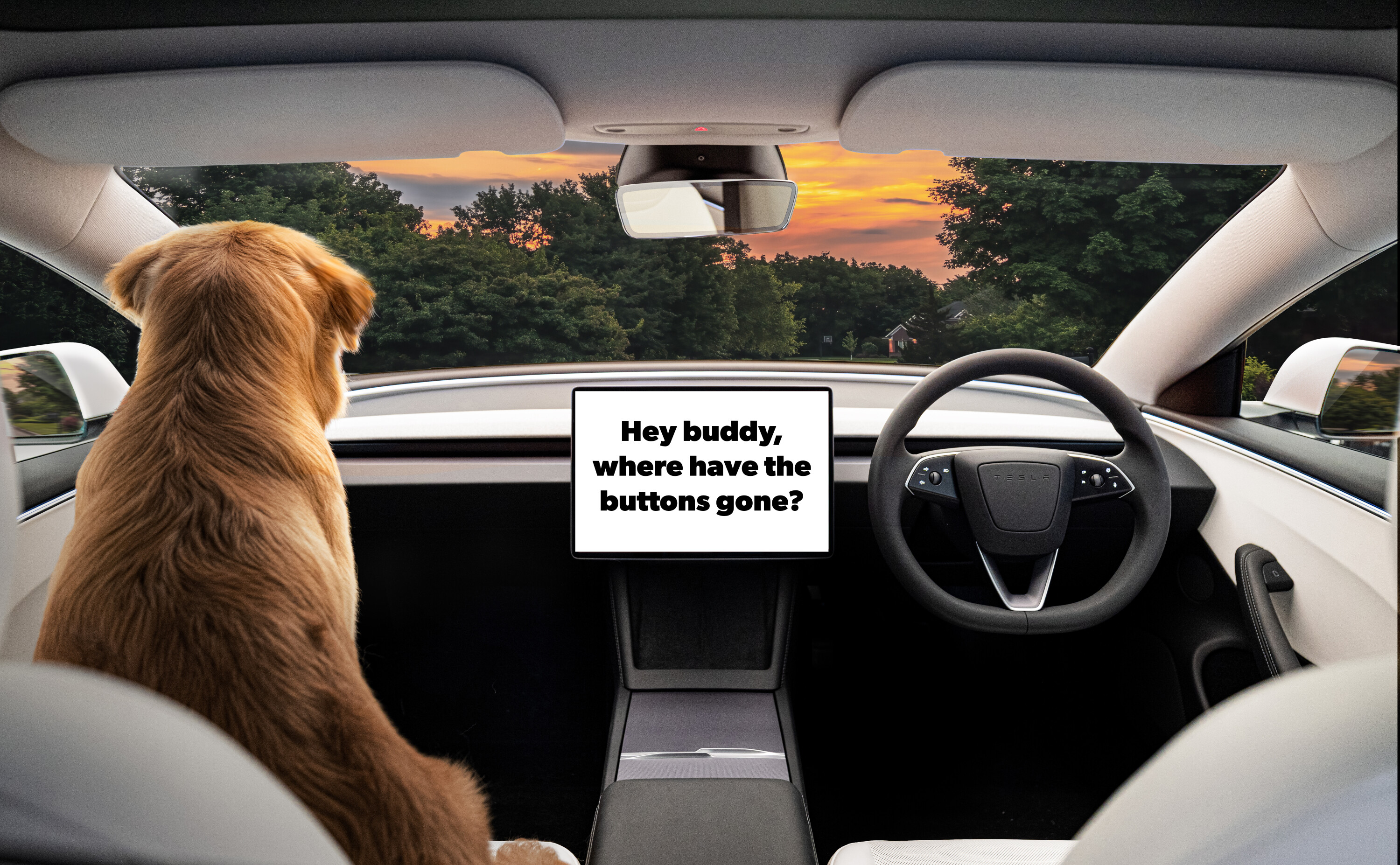
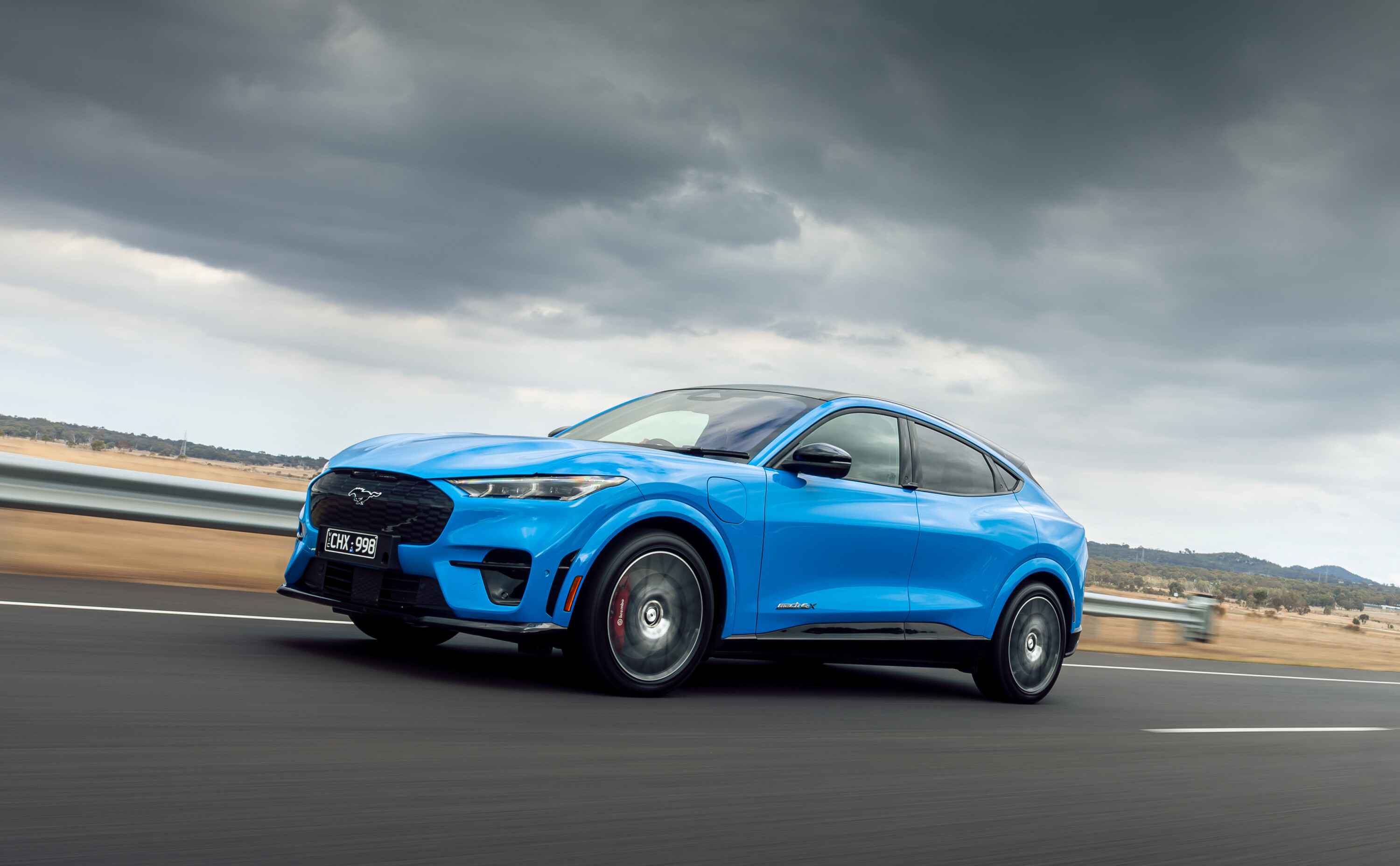
It isn’t only the VW Group that’s been waging war on buttons, of course. Tesla’s minimal cabin design is virtually button free. Lexus has long been a culprit of burying key functions inside multi-stage menus. And Ford seems to have followed Tesla’s example with the huge centre touchscreen in the soon-to-arrive Mustang Mach E.
The problem with buttons in car interiors, of course, is that they take up space. And, if you have too many of them – remember when Porsche went button mad with the previous-gen Panamera? – they can look ugly.
So you can understand why car companies have tried to get rid of them. Clean and minimal interiors also give manufacturers a chance to show how clever and high-tech they are with features like haptic feedback, touch-sensitive sliders and gesture control.
The issue, however, is actually using a high-tech, minimalist cabin can be incredibly frustrating. You could even call them a touch dangerous, given that some force you to take your eyes off the road as you prod, swipe and push to access the air recirculation, adjust the climate control or even adjust the volume of the stereo.
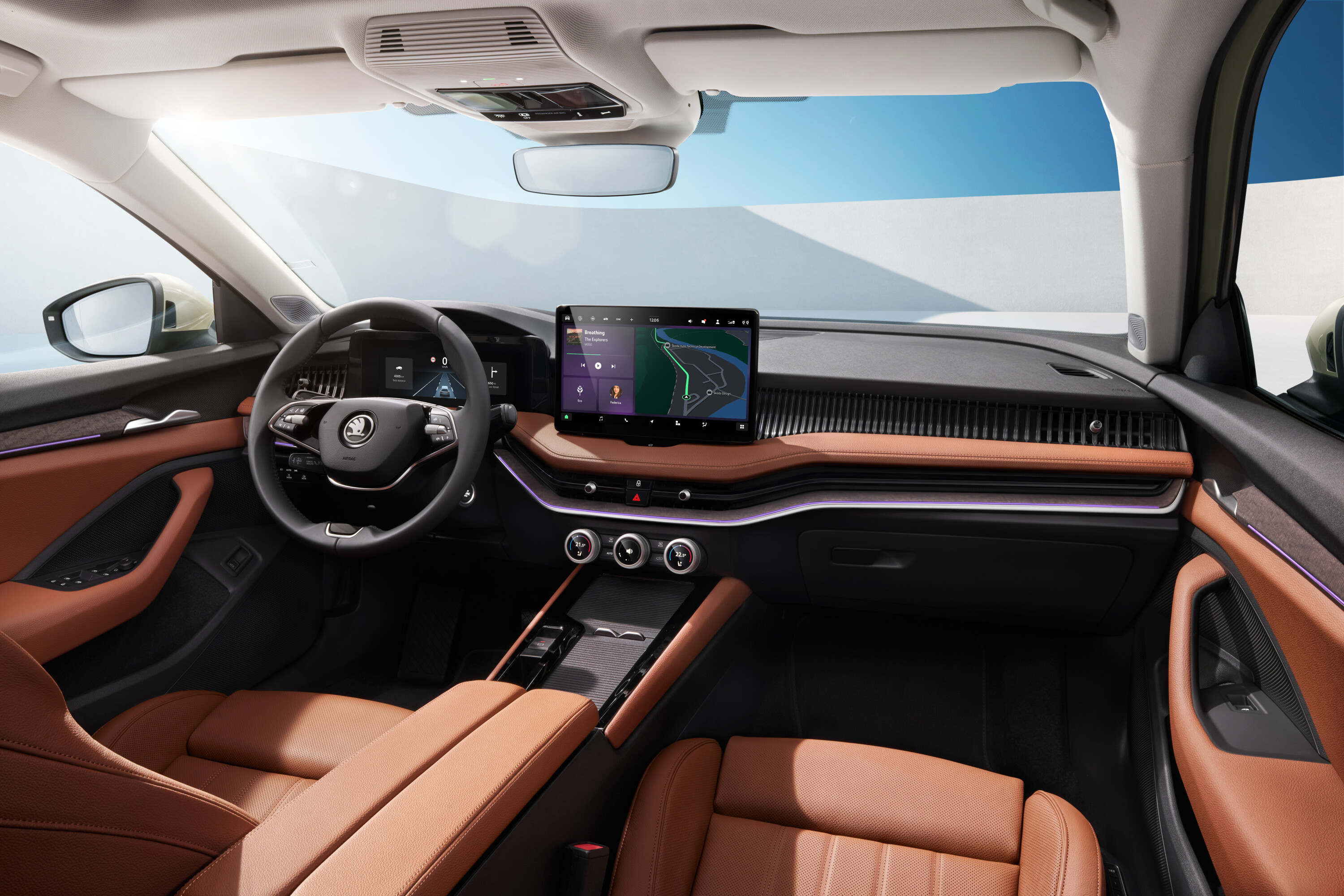
So what’s to be done? The good news is this is an issue that seems to be fixing itself.
Volkswagen has already corrected course with models like the new-gen Tiguan which will ditch the controversial haptic steering wheel buttons and climate control sliders. The next-gen Passat and updated Golf, which are due to debut in 2024, will also benefit from the more user-friendly approach.
Skoda has also made a big deal of the cabins of the new Superb and Kodiaq, which will arrive here in 2024. Both models debut new ‘smart dials’ which have their own mini 1.25-inch displays and can control various functions like the temp control, heat seating and ventilation. We’ve seen similar solutions for multi-function dials from Land Rover and Audi and they work well.
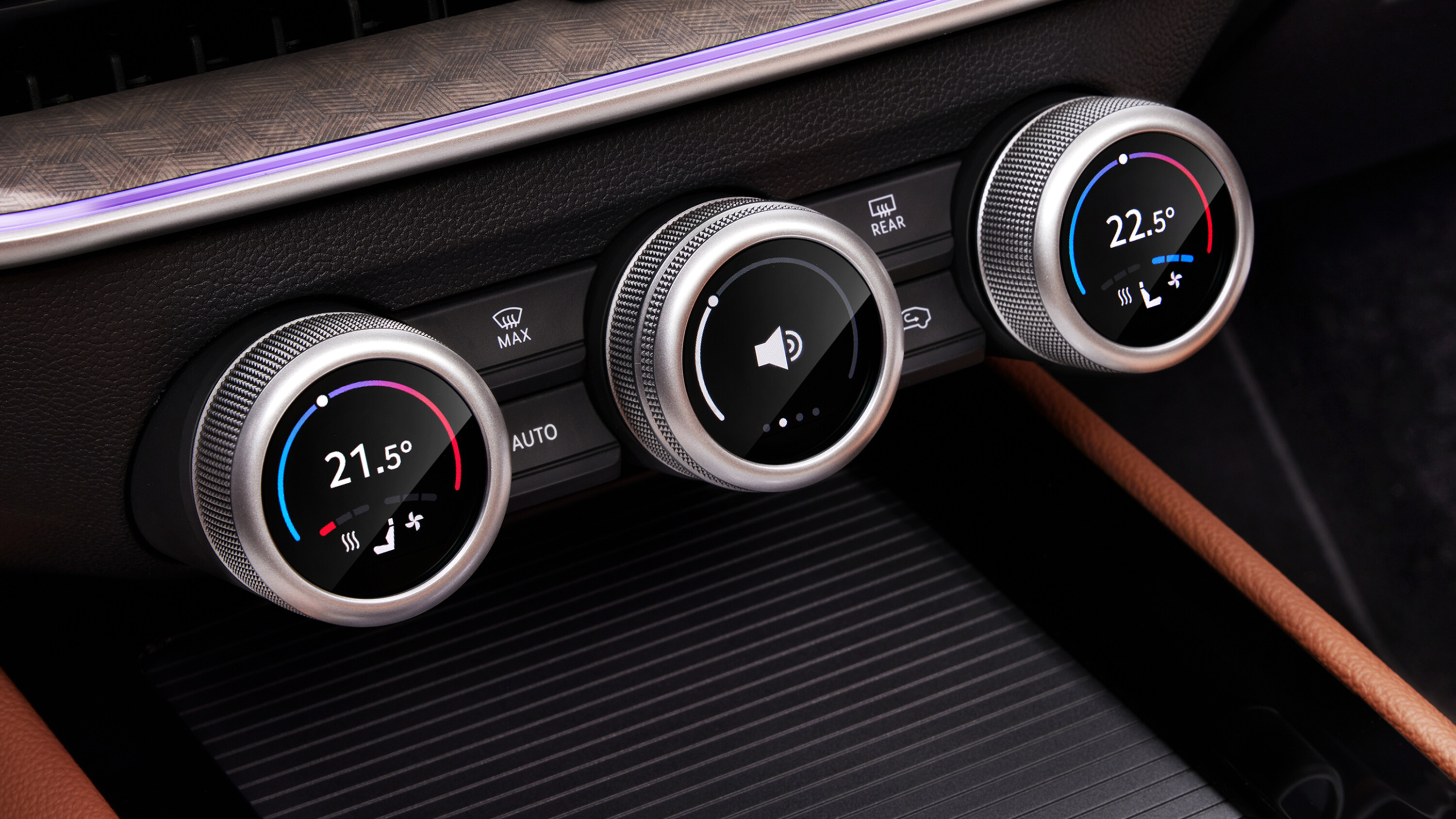
Hyundai’s head of design, Sang Yup Lee, is another fan of old-school buttons, and models like the Ioniq 5 and new-gen Kona strike a great balance between minimalism and sound ergonomics.
The lesson here is that customer feedback, and possibly whinging journos, can make a difference. It’s also a stark reminder of how easily the car industry can disappear down the rabbit hole of its own cleverness.
We’re huge fans of high-tech solutions and clever design here at Wheels but only if they make cars easier and safer to use. Not more difficult.
So kudos, Mr Shafer. We’ll notch the VW Group’s move back to buttons, dials and switches as a rare triumph of commonsense. All we need now is for similar thinking to be applied to “virtual mirrors”…


